
Prosper Loan Data
Introduction
This project is divided into two parts.
In the first part, we will conduct an exploratory data analysis on the dataset Prosper Loan Data. We will use Python data science and data visualization libraries to explore the dataset’s variables and understand the data’s structure, oddities, patterns and relationships. The analysis in this part is structured, going from simple univariate relationships up through multivariate relationships.
In the second part, We will take our main findings from our exploration and convey them to others through an explanatory analysis. To this end, We will create a slide deck that leverages polished, explanatory visualizations to communicate your results.
What is the structure of the dataset?
There are 113937rows and 81 columns in our dataset. Most entries are numerical and others categorical. The dataset contains information about the borrowers background and details about the loan from them we can create assumptions to loans in the future that are more likely for borrowers.
What are the main feature(s) of interest in the dataset?
The most I’m interested in wich features will have the highest impact on Borrowers APR (annual percentage rate) because as pre-assumption i think that this variable could be a game changer for borrowers and their conditions for loans.
What features in the dataset do you think will help support your investigation into your feature(s) of interest?
The Prosper Rating and score could show low Borrower’s APR because higher rating reflect the borrower’s personality to be more trustworthy. Creditscore could also have similar effect on Bor- rower’s APR as Prosper Rating.
For digging deeper into the analysis i filtered the most interesting variables and created a new data frame on them. The columns i’ve chosen for further investigation are: ’Term’, ’BorrowerAPR’, ’ProsperRating (Alpha)’, ’ProsperScore’, ’ListingCategory (numeric)’, ’Borrow- erState’, ’Occupation’, ’EmploymentStatus’, ’CreditScoreRangeLower’, ’CreditScoreRangeUp- per’, ’DelinquenciesLast7Years’, ’DebtToIncomeRatio’, ’StatedMonthlyIncome’, ’MonthlyLoan- Payment’, ’AvailableBankcardCredit’, ’LoanOriginalAmount’, ’EstimatedReturn’
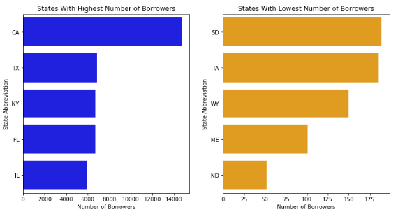
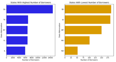
Observation #1:
The state of California, has by far the highest number of borrowers. On position two, three and four are the states of Texas, New York and Florida, wich are very close together. On the fifth place is the state of Illinois.
The state of Northdakota has by far the lowest number of borrowers. On position two and three we find the states of Maine and Wyoming, wich numbers of borrowers can clearly be separated. On position four and five we found the states of Iowa and Southdakota, wich are very close together.
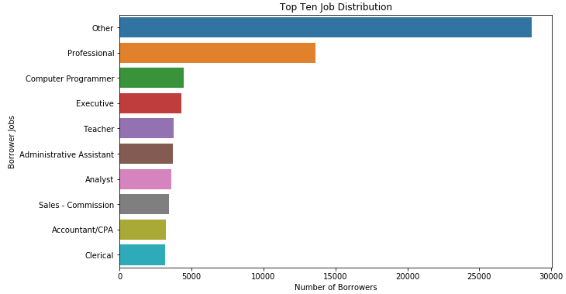
Question #2:
What is the Top Ten of most common Jobs of the Borrowers?
Observation #2:
According to the chart above we can see that GoBike has way more Male users than Females and others. Unfortunately in this case isn't clear if other means diverse or that the person wont share their gender with us.
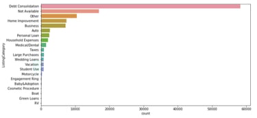
Question #3:
What are the most common reasons for taking a loan?
Observation #3:
In the Countplot above we can easily see that Debt Consolidation is by far the most common reason for borrowers taking a loan. On the second and third place dont dont have certain infor- mation becasue ’Other’ and ’Not Available’ could mean everything. The next four specific reasons we know are ’Home Improvement’, ’Business’, ’Auto’ and ’Personel Loan’
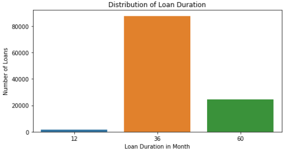
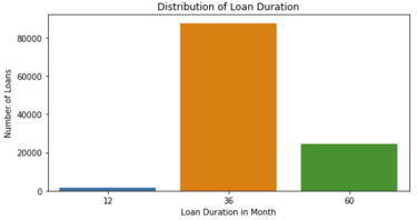
Question #4:
What is the most common duration for Loans ?
Observation #4:
The big majority of loans in the dataset were taken for a time period of 36 month wich are 3 years. The duration of 60 month wich are 5 years were in the middle and the time period of 12 month/1year has by far the lowest number of borrowers.
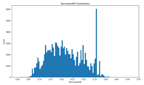
Question #5:
How is the borrower APR distributed?
Observation #5:
The borrowers APR distribution looks multimodal. There is a fist large peak at 0.2 and a much higher peak between 0.35 and 0.36. The most borrowers get a APR between 0.06 and 0.37.
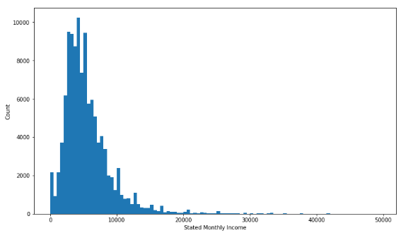
Question #6:
How is the borrowers monthly income distributed?
Observation #6:
The distribution of stated monthly income is clearly right screwed, with stated monthly income less than 30k and peak around 6K. There are some outliers at 100K and 40K that should be re- moved.
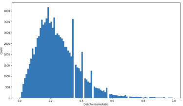
Question #7:
How is the borrowers dept to income ratio distributed?
Observation #7:
The distribution of debt to income ratio is basically right skewed with the highest peak at 0.2. Ther’re some gaps with missing information between 0.35 and 0.58 wich needs definetly further investigation because before the gap occurs always a peak for some reason.
Bivariate Exploration
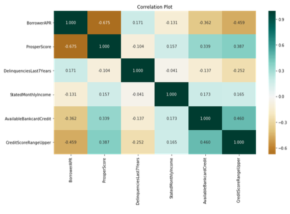
Question #8:
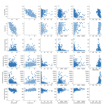
How does the values of the categories ’BorrowerAPR’, ’ProsperScore’, ’Delinquencies- Last7Years’, ’StatedMonthlyIncome’, ’AvailableBankcardCredit’, ’CreditScoreRangeUp- per’ correlate with each other in a correlation plot?
Observation #8:
There are no very strong relationships between any pairs. But for instance there is a slightly high positive correlation between CreditScoreRangeUpper and AvailableBankcardCredit wich makes sense because higher AvailableBankcardCredit has a better creditscore. BorrowerAPR and Pros- perScore are slightly negative correlated because borrowers with lower score are more likely to pay higher APR. Similarly, higher CreditScore means the borrowers are more trustworthy, therefore it recevied lower APR.
Question #9:
How does the values of the categories ’BorrowerAPR’, ’ProsperScore’, ’Delinquencies- Last7Years’, ’StatedMonthlyIncome’, ’AvailableBankcardCredit’, ’CreditScoreRangeUp- per’ correlate with each other in a scatter plot?
Observation #9:
Similar to the correlation plot, we can determine which pair has negative or positive relationships from analyzing the pattern in each scatter plots. ProsperScore seems to be more related to Bor- rowerAPR compared to other variables. StatedMonthlyIncome does not give useful information on BorrowerAPR and will not be further analyzed.
Question #10:
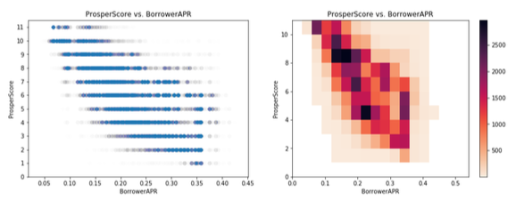
Let’s pick up the variables with the highest negative correlation ProsperScore and Bor- rowerAPR. We already had an assumption about the meaning of the correlation but how do they correlate if we dig deeper into detail?
Observation #10:
After going more into detail with a scatterplot and heatmap it seems that our assumption from the plots before has been confirmed. In both plots we can detect a negative correlation. Because people with higher Prosper Rating tend to be more reliable and therefore given lower BorrowerAPR.
Question #11:
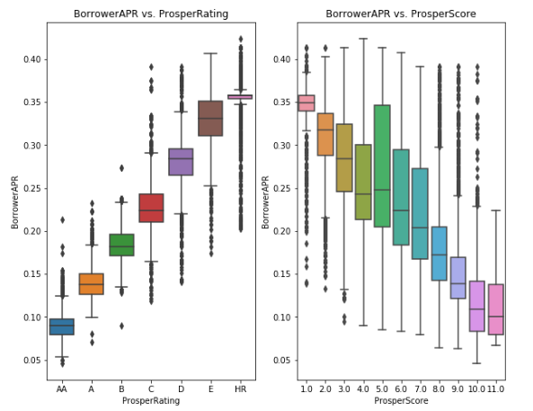
How different does the borrower APR behave in a box plot when we compare it with Prosper Score and Prosper Rating?
Observation #11:
In this two box plot we can see a positive and a negative correlated relationship wich actually have a very similar meaning. On the left side we see a positive correlation between BorrowerAPR and ProsperRating and on the right side we have a negative correlation between BorrowerAPR and ProsperScore. This means that borrowers with a good rating like ’AA’ or ’A’ will get an lower APR as well as borrowers with a high ProsperScore.
Multivariate Exploration
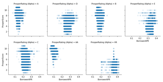
Question #12:
How does the ProsperScore and the borrower APR correlate in each different Prosper- Rating?
Observation #12:
This visualization helps to analyse BorrowerAPR and ProsperScore on different ProsperRatings. The patterns shows the lowest rating(HR) of borrowers have the highest APR. For high rating A(A), the borrowers has the lowers APR. This visualization of different groups of people in terms of APR received based on their rating and scores.
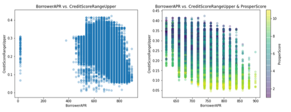
Question #13:
How does the scatterplot change if we add the ProsperScore to the relationship of borrower APR and CreditScoreRangeUpper?
Observation #13:
Since CreditScoreRangeUpper and ProsperScore are positive correlated to BorrowerAPR, this plot helps us to see the effects on BorrowerAPR. We can see the CreditScoreRangeUpper increase when BorrowerAPR decrease in the plots. By adding ProsperScore to color encodings, borrower APR decreases as ProsperScore increases. This proves the point that CreditScoreRangeUpper and ProsperScore are negative correlated to borrowerAPR.
Conclusion
In the exploratory data analysis on the prosper loan dataset we got many insights through the different types of variable exploration. In the first step of preliminary wrangling i started to get an overview about the data. Than i filtered the data and created a new data frame with columns that are potentially interesting for further investigation.
In the second step of univariate exploration i analyzed some categorical variables first to get some information about the borrowers background with the state of most borrowers to the state of the fewest borrowers and their most likely jobs. Surprisingly the majority of borrowers wont share their specific job titles with us as well as their reason for taking the loan wich i got to know in the next analysis where i first needed to create a new column wich allocates the numeric listing categories to strings. In the last part i analyzed the distribution of borrowerapr, depttoincome ratio, and monthly income where i found a weird pattern of missing values.
Through the bivariate exploration i started to dig deeper into detail of relationships between several variables with correlation- and scatter matrices. In this part i found many negative correlation between some variables. The strongest negative correlation always depending on BorrowerAPR so i decided to proof this with plot ing heatmaps and more detailed scatterplots.
In the last step of multivariate exploration i tried to figure out the relationships between BorrowerAPR and other variables through different time periods and and ratings. There i got many interesting insights wich lend me to meaningful conclusions in the end of the analysis.
Univariate Exploration
Question #1:
Wich State has the highest and the lowest number of borrowers?


Question #14:
How does the relationship of EstimatedReturnRate and BorrowerAPR depend on CreditRating?

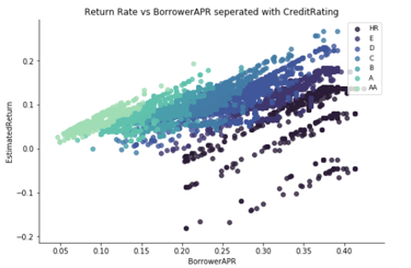
Observation #14:
Since BorrowerAPR are determined according to the ProsperRating, we can see here how the risk is dispersed among the expected returns. In particular, it would appear as an investor will have to tread very lightly with Borrowing APR’s over 20% as their is significantly larger chance of losing MORE portions of their investment.